Movers Redesign
Turning an ignored AI feature into a daily task tool for pharma sales teams

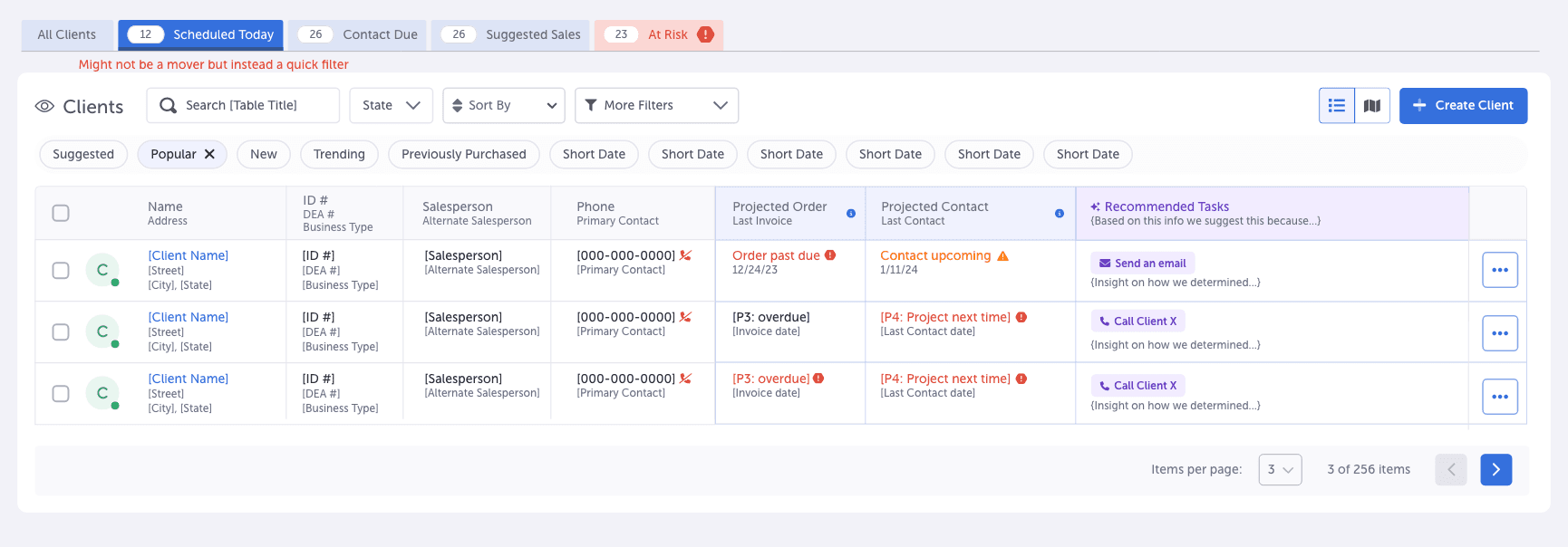

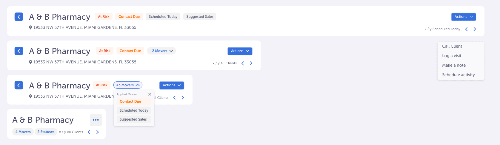
An AI feature nobody used, inside the CRM reps live in all day.
Setting an expectation
This project is less about stylistic UI and more about demonstrating my ability to solve complex UX problems at scale.
- Lead Product Designer
- Lead UX Researcher
- 12+ months
- Phase 1 shipped
- Rafi AlmhanaProduct Manager
- Austin HollandUI/UX Team Lead
- Jesse BrunerUI/UX Designer
- Ryan CarrollBusiness Analyst
- Figma
- Adobe XD
- Miro
- Jira
The product
SupplyMover is a CRM that Workd, a startup, built for pharma sales teams. Movers are its AI powered feature: a set of smart lists that flag the records a rep should act on today. Each list is its own Mover, like the At Risk Mover for accounts that need attention.
The users
Sales reps and sales managers who live in the CRM all day and need to know what to work on next.
What was broken
The Movers were cluttered and inconsistent. Reps didn’t know why records showed up in them or what to do next, and many didn’t know the feature existed.
My role
I was the lead designer and sole researcher on the Movers redesign, from discovery to developer handoff. I ran every interview and usability test, and reframed what the Movers were for, which shaped a redesign that made reps 20% faster in testing.
With my team, I set scope and priorities with our PM, Rafi Almhana, mapped current workflows with our business analyst, Ryan Carroll, and pressure tested ideas in brainstorms and critiques with designers Austin Holland and Jesse Bruner.
Nobody agreed on what Movers were for.
Challenge statement
The Movers weren’t failing because of the UI. They were failing because nobody, including our own team, agreed on what a Mover was.
Background
The Movers lived inside SupplyMover, the CRM Workd built for pharma sales teams. They were meant to help reps finish their daily tasks faster, but reps ignored them because they didn’t solve real problems or fit how reps actually worked.
Show more details
Goals
• Get reps using the Movers again. • Make it clear which tasks matter most. • Cut the time it takes to finish tasks.
Constraints
• Had to work within the existing design system and components. • Limited client availability for testing and feedback. • Legacy system dependencies. • Other initiatives competing for the same dev time.
Talking to reps showed exactly where the Movers broke down.
User interviews
I started with interviews to see how sales reps and managers actually used the Movers in SupplyMover day to day.
The conversations focused on daily workflows and surfaced friction around speed, relevance, and finding insights.
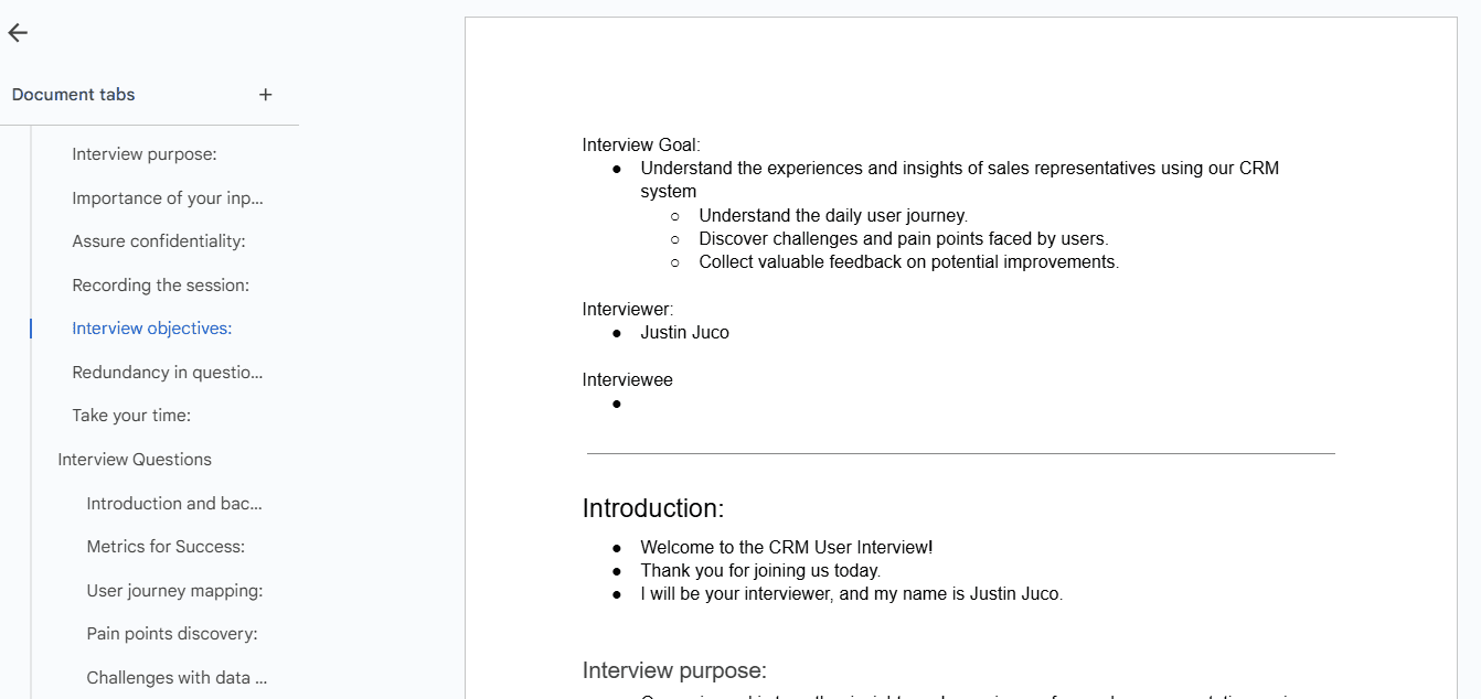
Interview script: https://tinyurl.com/mwm4fr9z
Competitive analysis
I reviewed how HubSpot, Salesforce, and Monday.com handle filtering and data visibility. That set the bar for filter hierarchy, quick access controls, and surface level insights, so the Movers could feel familiar but faster.
User journey mapping
With our PM and business analyst, I mapped how reps searched, filtered, and saved data in the CRM. It exposed the exact moments reps lost time, toggling between views or waiting on pages to refresh.
Mapping how reps actually worked before designing anything.
Brainstorming & collaboration
In brainstorms with the design team, we defined clear rules for when and why records show up in each Mover.
We also explored layout changes, like moving the Movers above the tables as tabs so switching between views would be faster and easier to follow.
User flows
I mapped current and ideal workflows in Miro to find where reps were losing time. The flows exposed the navigation inefficiencies and helped validate how the new layout would simplify finishing tasks.
From rough ideas to a layout reps could navigate on their own.
Early design exploration
I started turning early ideas into designs, testing tooltips, highlights, and icons to explain why records showed up in the Movers.
They added context but also a lot of visual noise, and hid the reason behind a hover. That pushed me toward dedicated table columns instead.


High fidelity design
From there I redesigned the Movers as tabs above the data tables, with two new columns: “Why it’s here” and “What to do next.” Each record’s purpose and next step became clear at a glance.
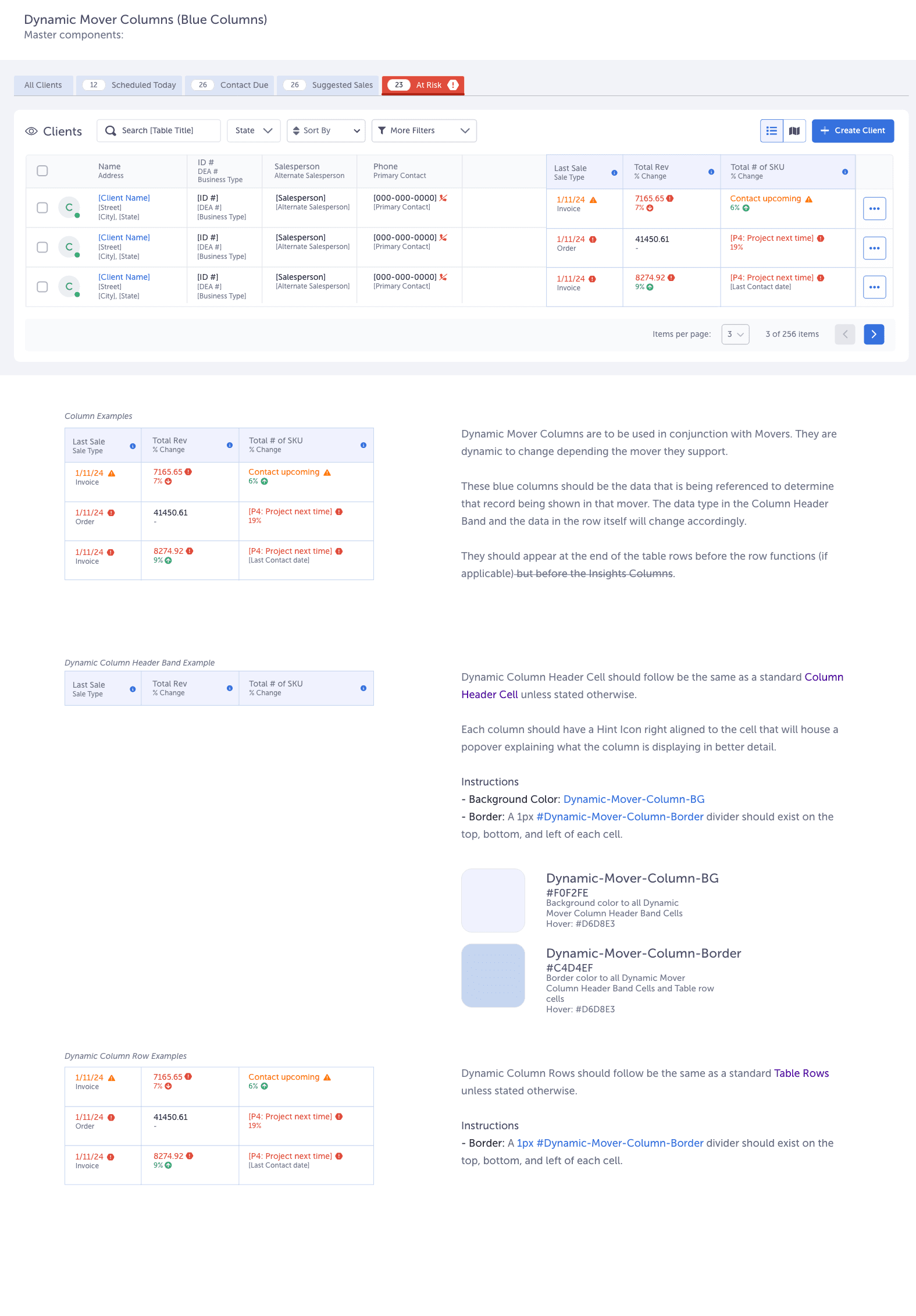
I also clarified static versus dynamic columns so reps could tell fixed fields from data driven ones.
Prototyping & validation
I built interactive prototypes in Adobe XD of the redesigned Movers on the Clients page. In usability sessions, reps understood the layout quickly and finished tasks with minimal guidance.
Usability tests proved the direction and shaped what changed.
Usability tests
I ran task based usability tests with sales reps and managers using the prototypes. Reps finished tasks faster, with more clarity and confidence.
Testing showed transparency was the key to adoption. Reps wanted explicit direction, not just explanations, and the two column design confirmed the new definition of the Movers.
Seven problems reps hit, and how the redesign fixed each one.
The redesign at a glance
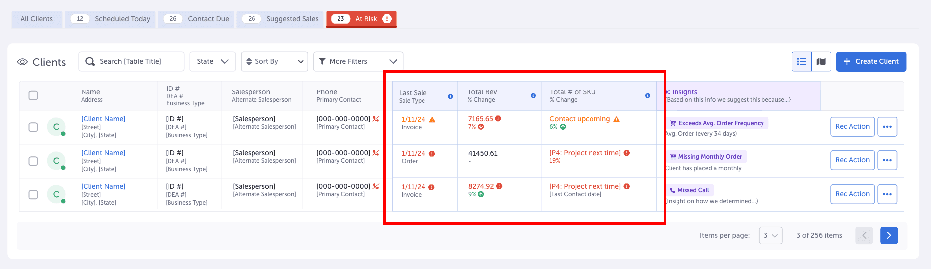
01Explain why every record is there
Reps didn’t know why records showed up in the Movers, so they didn’t trust them.
Added a dedicated “Why it’s here” column to every Mover view so the reason is always visible.
Show more details
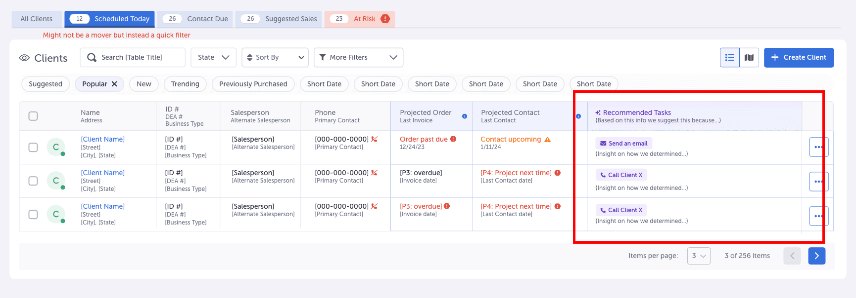
02Show reps the next step
Once records appeared, reps had no clear path forward.
Added an action column that shows exactly what task clears the record from the Mover.
Show more details
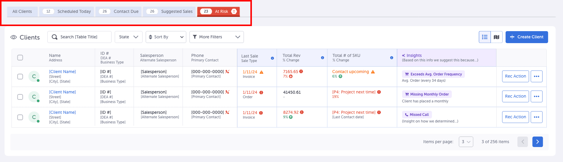
03Make the Movers feel like navigation
Sitting inside the tables, the Movers felt like basic filters instead of a way to navigate tasks.
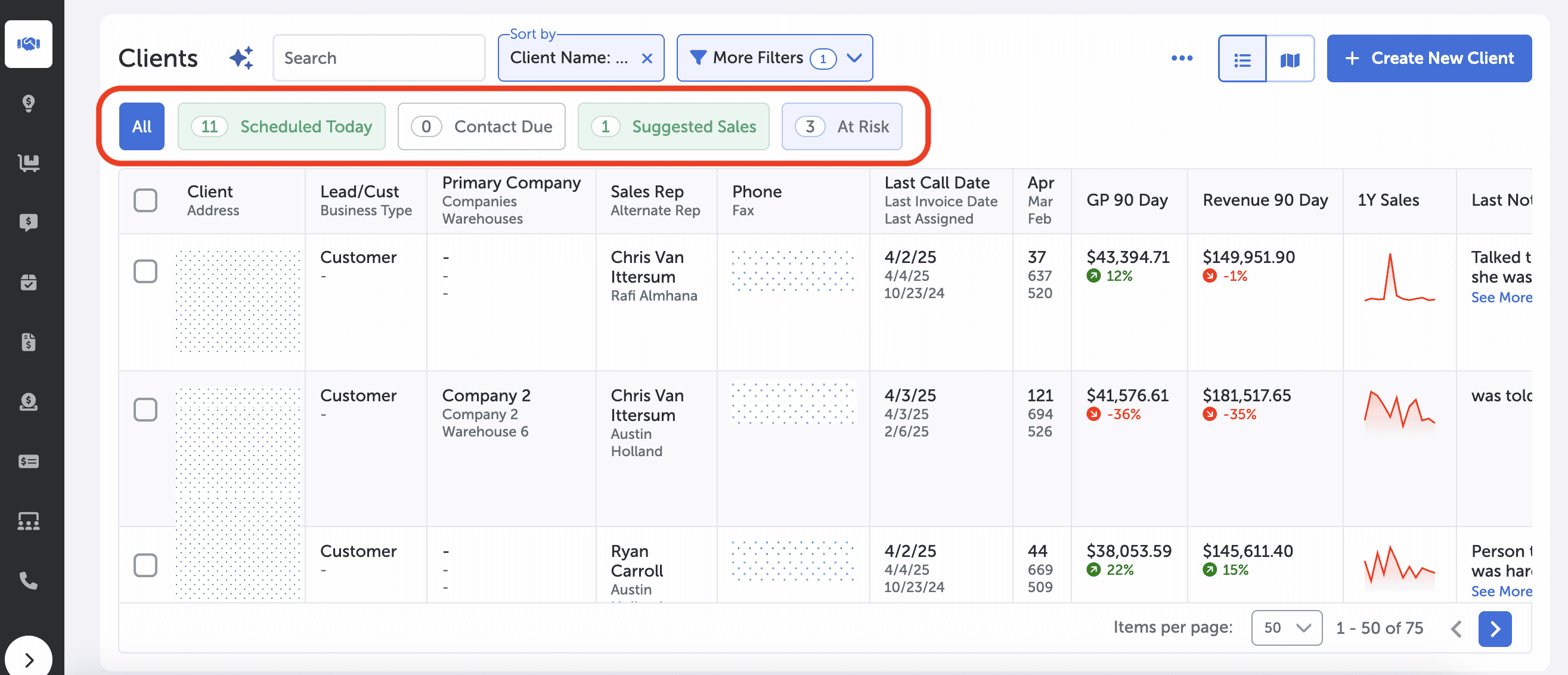
Moved the Movers above the tables and styled them as familiar tabs, giving them clearer hierarchy and making them easier to adopt.
Show more details
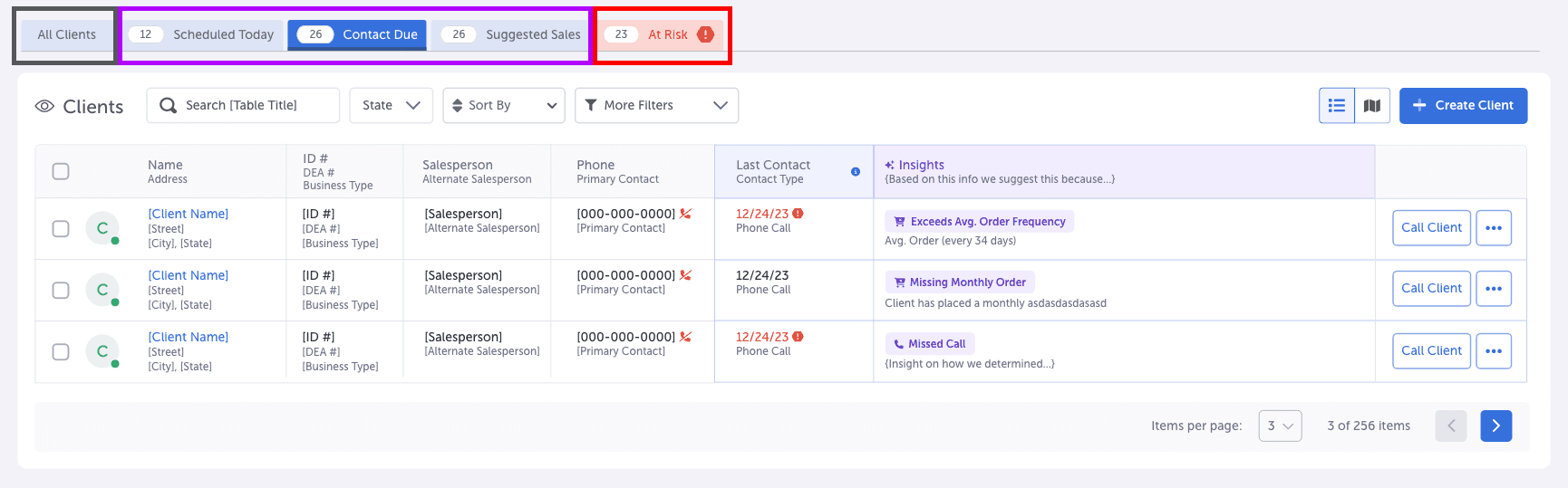
04Set clear rules for when Movers show up
Reps couldn’t tell which Movers would always be there and which only showed up sometimes.

Static Movers always show, even when empty, so reps know they’re done. Dynamic Movers, like the At Risk Mover, only appear when records meet their conditions.
Show more details
05Keep context on detail pages
Records lost all Mover context once reps clicked into a detail page.
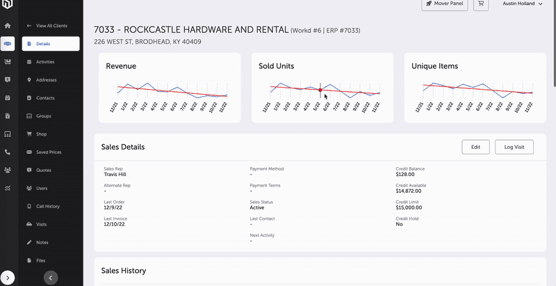
Added Mover tags, ordered by priority, to record detail pages so the context carries through the whole workflow.

Show more details
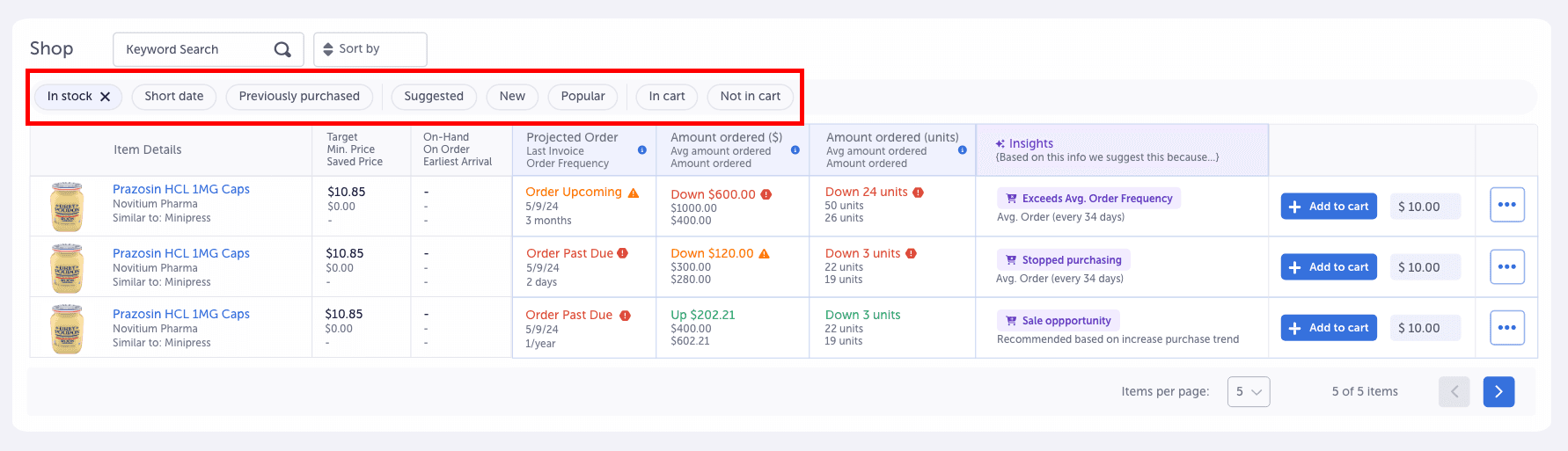
06Protect the definition by saying no
Yes or no Movers, like New, didn’t fit the new definition, but reps still needed them.

Turned them into stackable smart filters inside the tables, separate from the Movers, so every Mover still means there’s work to do.
Show more details
07Align the team on one definition
Even our own team defined the Movers differently, which left the design direction unclear.
Got stakeholders to agree on one definition: Movers are a task completion tool first, with KPI tracking second.
Show more details
No client funding, so I shipped it in phases and documented the system.
Why phases
The Movers redesign was an internal initiative with no client funding, so dev time had to be balanced against paid client work. Waiting for one big release would have meant waiting indefinitely.
So I split the rollout into phases, each one useful on its own. That let us release an MVP quickly, gather feedback from real use, and build toward the full vision without overloading the dev team. Phase 1 shipped while I was on the team.
Design system documentation
I documented every new pattern and added it to the design system so other teams could build on it: • New Movers tab components • Updated table column patterns • Mover tags in record details • Smart filters • Static and dynamic Mover states • Interaction rules and constraints


Faster tasks, and a feature reps actually wanted.
Phase 1 shipped, and reps finally understood what Movers were for.
“I will actually choose to use this every day now. Now that I finally understand what it does.”